Cradlewise's app, while innovative, faced several design-related challenges that hindered its ability to deliver a seamless user experience:
Inconsistency Across Screens: Every screen had a unique look and feel, leading to a disjointed user experience
Cradlewise's app, while innovative, faced several design-related challenges that hindered its ability to deliver a seamless user experience:
Inconsistency Across Screens: Every screen had a unique look and feel, leading to a disjointed user experience
Typography Chaos: The usage of two different fonts lacked a clear rationale, muddying the visual hierarchy and communication effectiveness.
Hardcoded UI Elements: The prevalence of hardcoded UI elements meant that any change required substantial time and effort, significantly slowing down development.
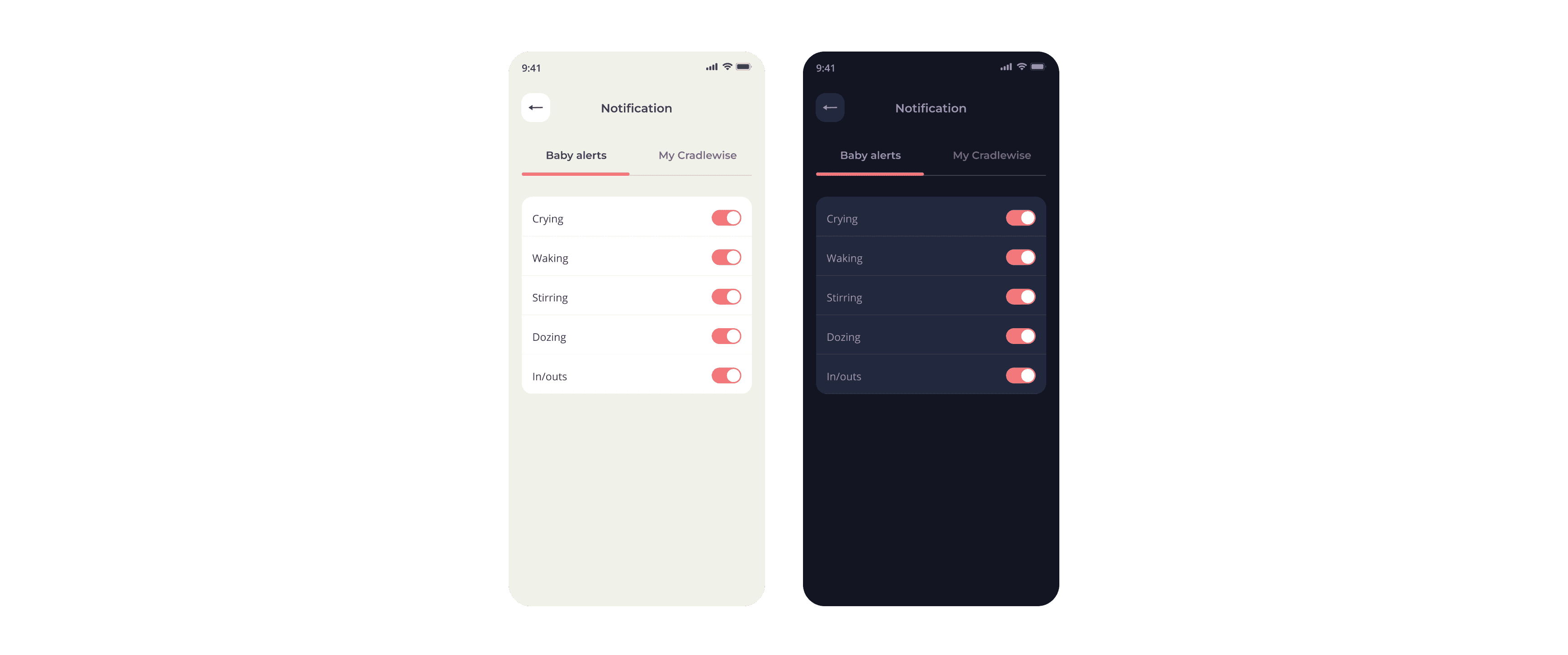
Dual Theme Design Burden: The necessity to design for both dark and light modes doubled the workload for our designers, creating inefficiencies in our design process.
So that's why a design system was required.
So that's why a design system was required.
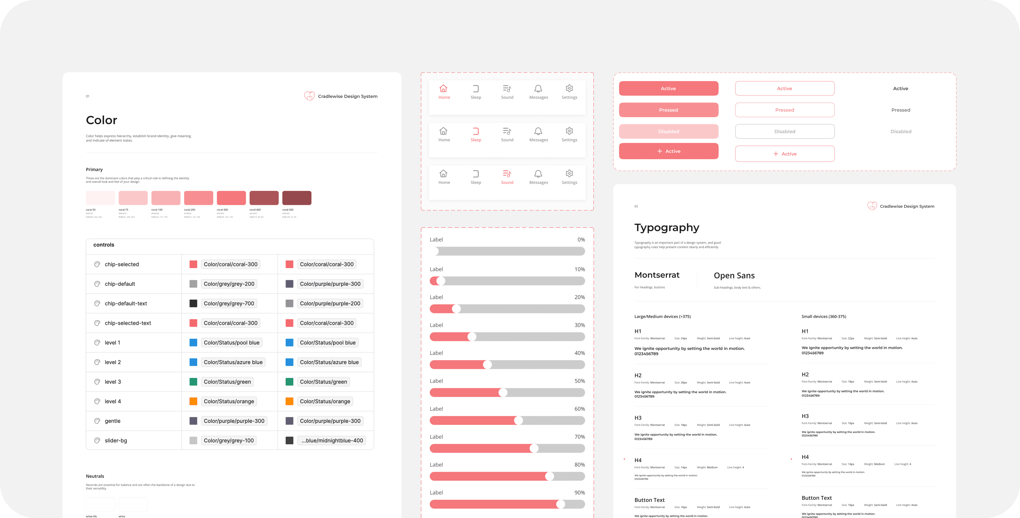
The first step was a comprehensive audit of our existing UI components. Given our focus on parents and their babies, it was crucial to adjust our UI elements to convey trust, safety, and a sense of calm. This meant reevaluating everything from color schemes to the geometry of components to ensure they resonated with our target users' needs and preferences.
I planned I'll first define foundational elements and then create components out of it (pretty simple approach).
I planned I'll first define foundational elements and then create components out of it (pretty simple approach).
01
Foundation
Typography, Colors, Spacing
01
Foundation
Typography, Colors, Spacing
02
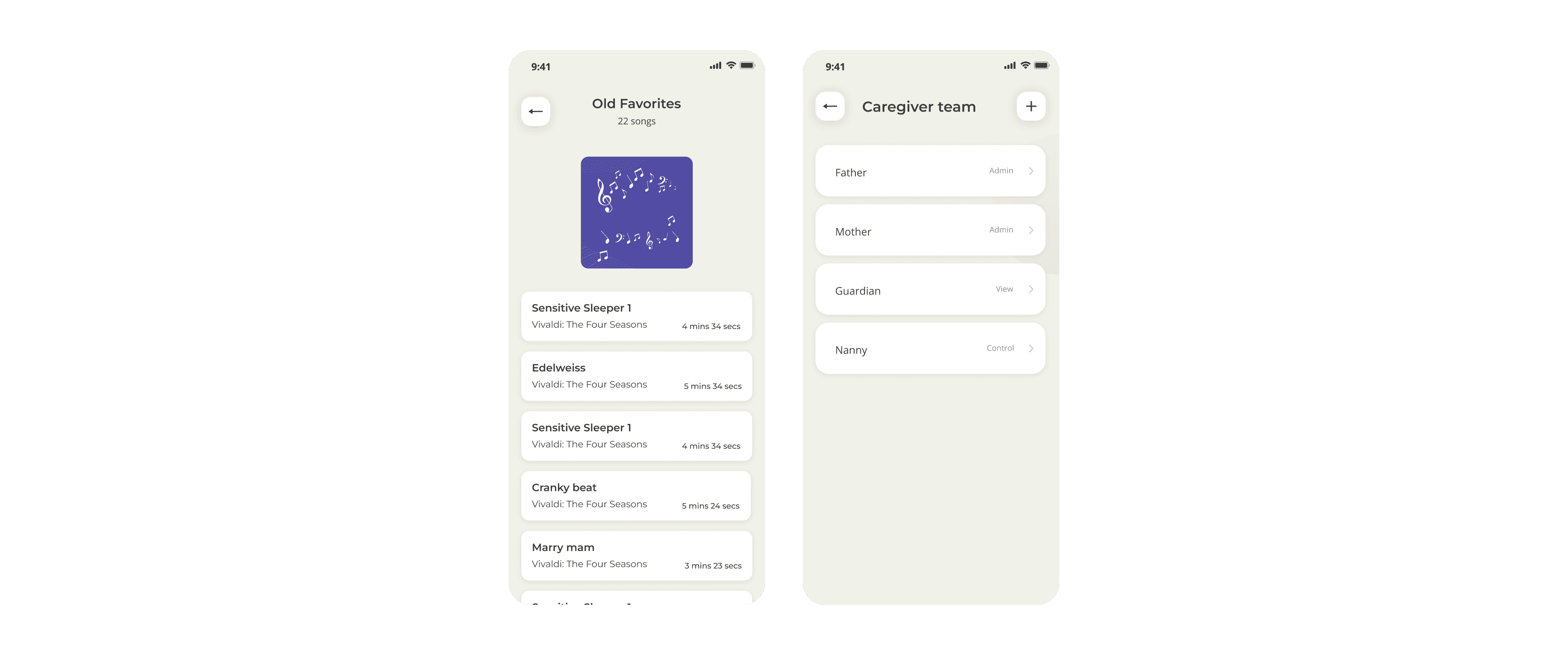
Components
Buttons, controls, cards, bottom sheets, tooltips, etc
02
Components
Buttons, controls, cards, bottom sheets, tooltips, etc
Crafting Hush Design System
Crafting Hush Design System
I named it "Hush" as it is an evocative and fitting name, particularly given the context of Cradlewise as a baby-centric app. The word "Hush" conjures images of tranquility, comfort, and calmness, aligning perfectly with the ethos of your product aimed at soothing babies and providing peace of mind to parents.
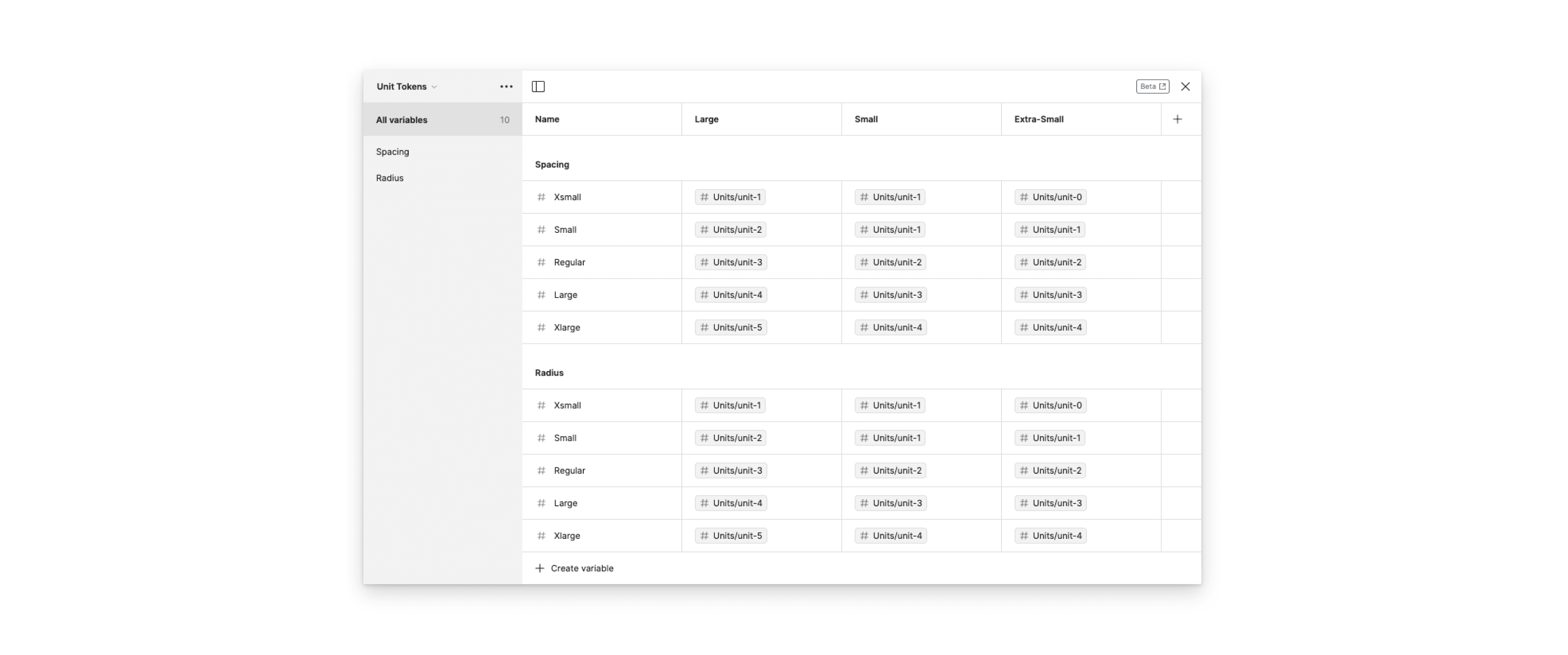
To address our typographic chaos, I established a clear hierarchy and purpose for our fonts: Montserrat for headings, subheadings, and calls-to-action, and Open Sans for all other text types. This decision was informed by their readability and emotional impact, crucial for engaging our audience across large phones, and small to extra small devices. This thoughtful typography strategy significantly improved our content's accessibility and user engagement.
I defined a type system tailored for three types of devices: Large, Small, and Extra-Small. Different devices possess unique viewing contexts and limitations. What may appear visually pleasing on a large phone could feel cramped on a smaller screen, and vice versa.
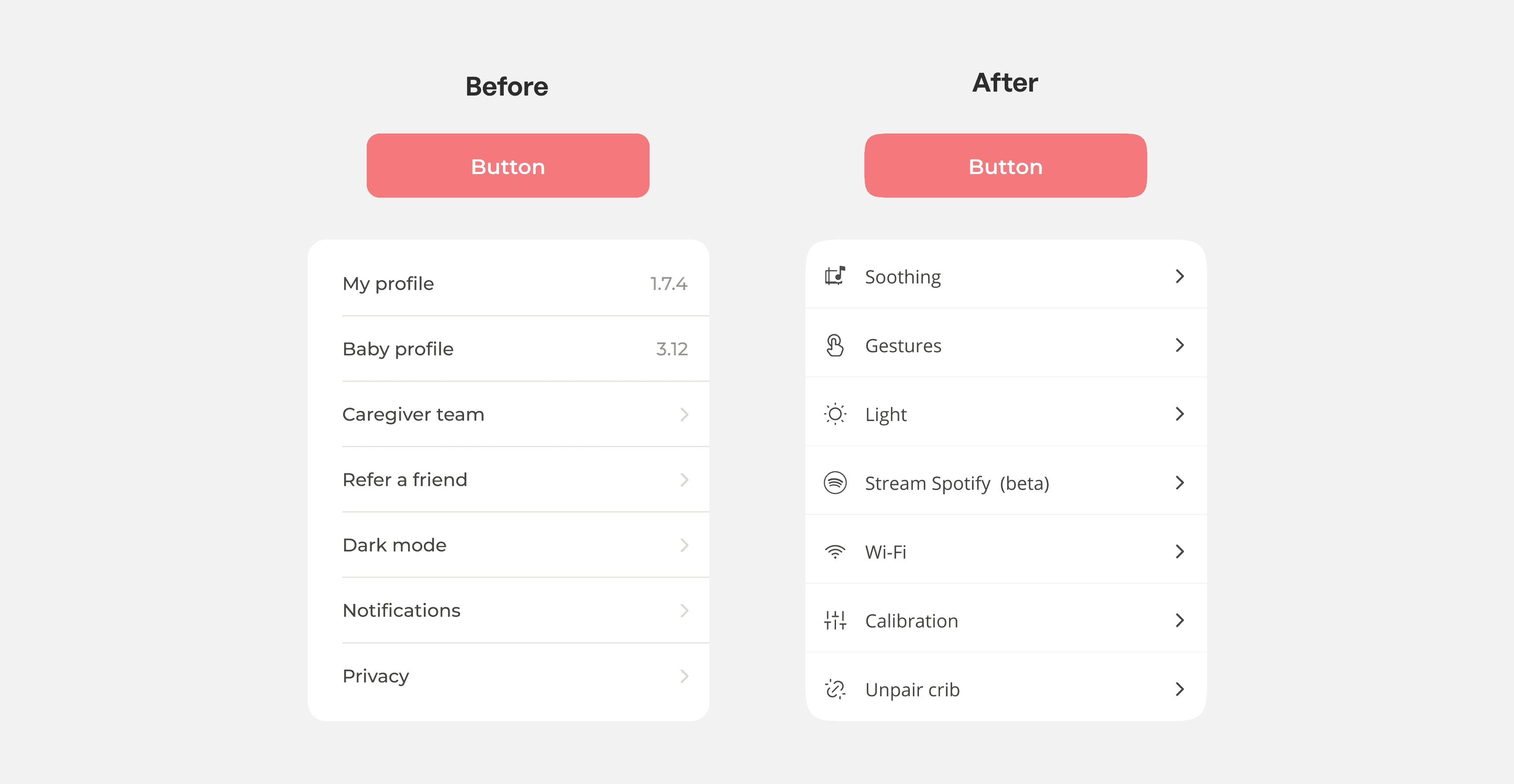
With a focus on evoking trust and friendliness in our user interface, I refined our UI components to embody a softer, more welcoming aesthetic. Employing squircle shapes for cards and buttons, we achieved a smoother, more approachable look, resonating with our ethos of comfort and care for babies and parents alike.
Rounded corners in a baby app UI psychologically signal safety and warmth, fostering a nurturing and welcoming environment that resonates with parents’ desire for a gentle and caring experience.
Rounded corners in a baby app UI psychologically signal safety and warmth, fostering a nurturing and welcoming environment that resonates with parents’ desire for a gentle and caring experience.
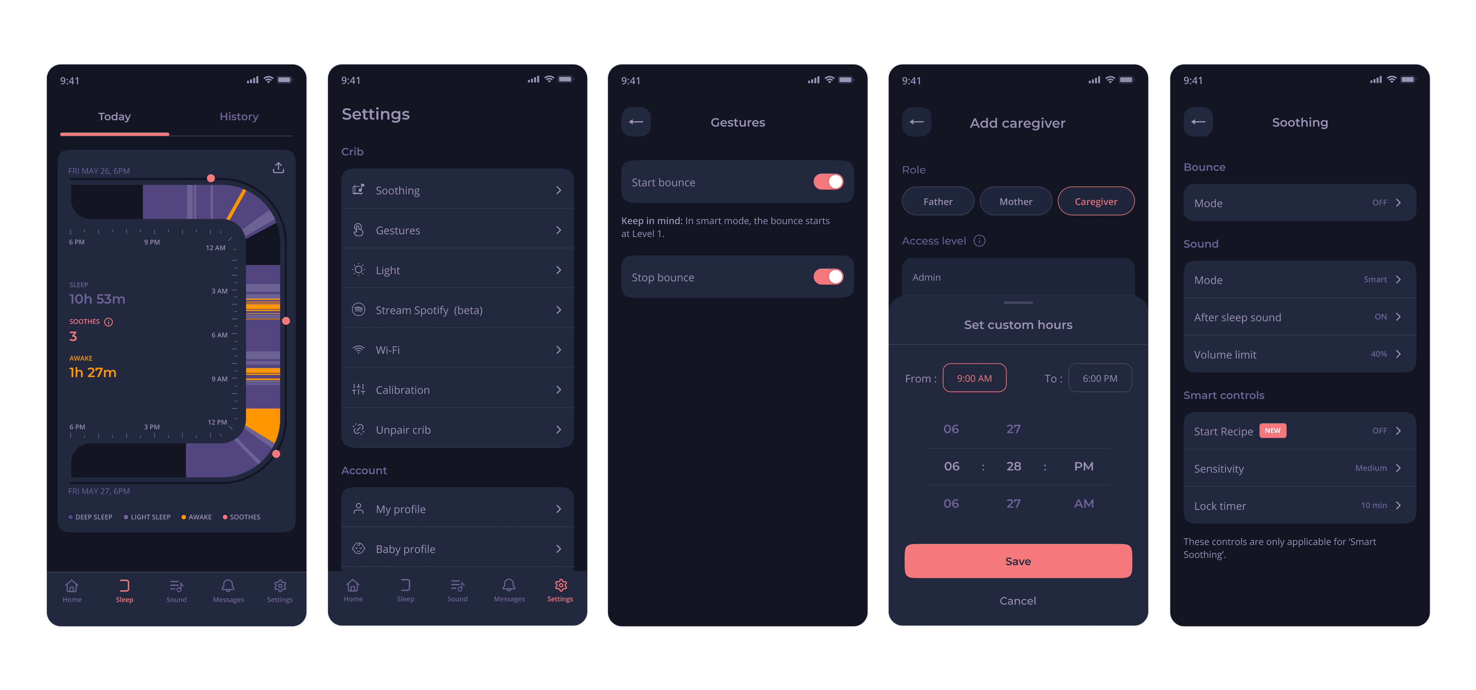
I designed only those components that were required at that time.
I designed only those components that were required at that time.
I created some product illustrations too. They were used to teach how to set up crib at the time of onboarding.
I created some product illustrations too. They were used to teach how to set up crib at the time of onboarding.
Implementation and Collaboration
The journey from design conceptualization to full implementation was not without its challenges. Collaborating closely with the tech team, we navigated through the complexities of integrating the design system across all screens. This process involved continuous dialogue, iteration, and compromise, ensuring that our design vision was realized without compromising on functionality or performance.
We created logics around using a UI component. For ex - A bottom sheet will be used for every L2 actionable item.
It took a month to design and implement this across every screen on the app.
With new and reusable components, we significantly saved bandwidth for both the tech and design teams.🎉🎉
It took a month to design and implement this across every screen on the app.
With new and reusable components, we significantly saved bandwidth for both the tech and design teams.🎉🎉