HOW WE SAVED 400 CRIB RETURNS
Revamped the dashboard of a baby monitoring app, which is a remote control for a smart crib for babies.
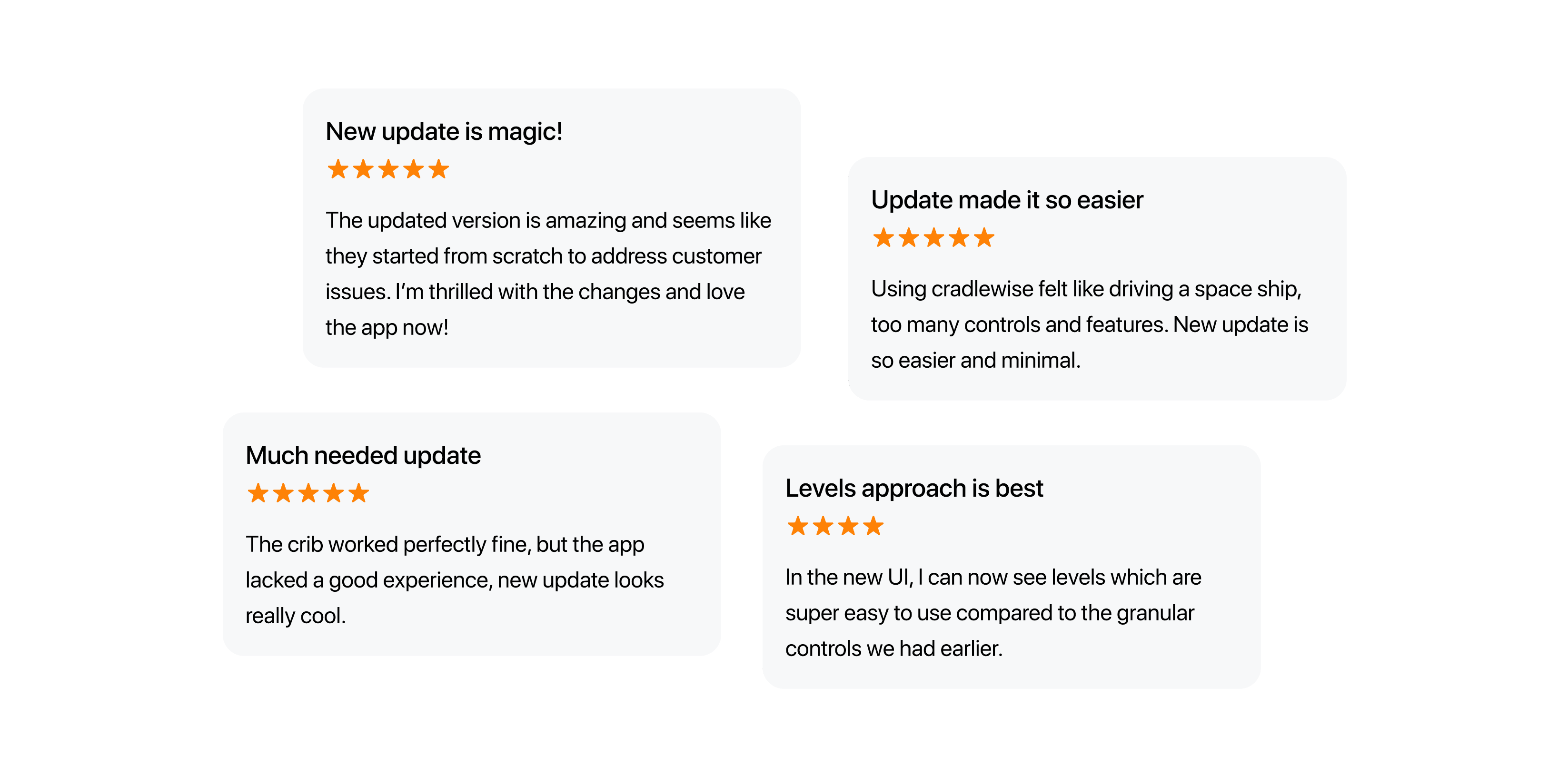
I led the end-to-end design direction of mobile experience. The new design was loved by people & helped us decrease crib returns.
Revamped the dashboard of a baby monitoring app, which is a remote control for a smart crib for babies.
I led the end-to-end design direction of mobile experience. The new design was loved by people & helped us decrease crib returns.
My role
My role
Research &
Product Design
Research &
Product Design
Team
Team
Srishti Mahajan (Product Manager)
Unnikrishnan Manikoth (Design Manager)
Srishti Mahajan (Product Manager)
Unnikrishnan Manikoth (Design Manager)
Timeline
Timeline
2 months
2 months
Outcome
Outcome
Saved a lot of money
UNDERSTANDING THE PRODUCT
Cradlewise is a smart crib that lets users monitor their baby through a smartphone. The crib can bounce, play white noise (sounds that help babies sleep), provide live video of your baby, and much more.
Perhaps this video can provide a better understanding.
WHY DO WE CALL IT A 'SMART CRIB'?
The most frequently utilized feature of the crib is auto-bounce, closely followed by auto-sound. The crib automatically bounces in response to the detected state of the baby. For a baby, auto-bounce/sound detects three states:
- Awake
- Stirring (about to sleep)
- Sleep
There is a fixed time for an auto bounce session, i.e ~30 minutes. If the baby does not responds or changes state in these 30 minutes, the crib will stop. However user can change this in settings and make it bounce for longer.
You can refer this video, if not clear:)
USER INTENTS WHILE USING HOME SCREEN
01
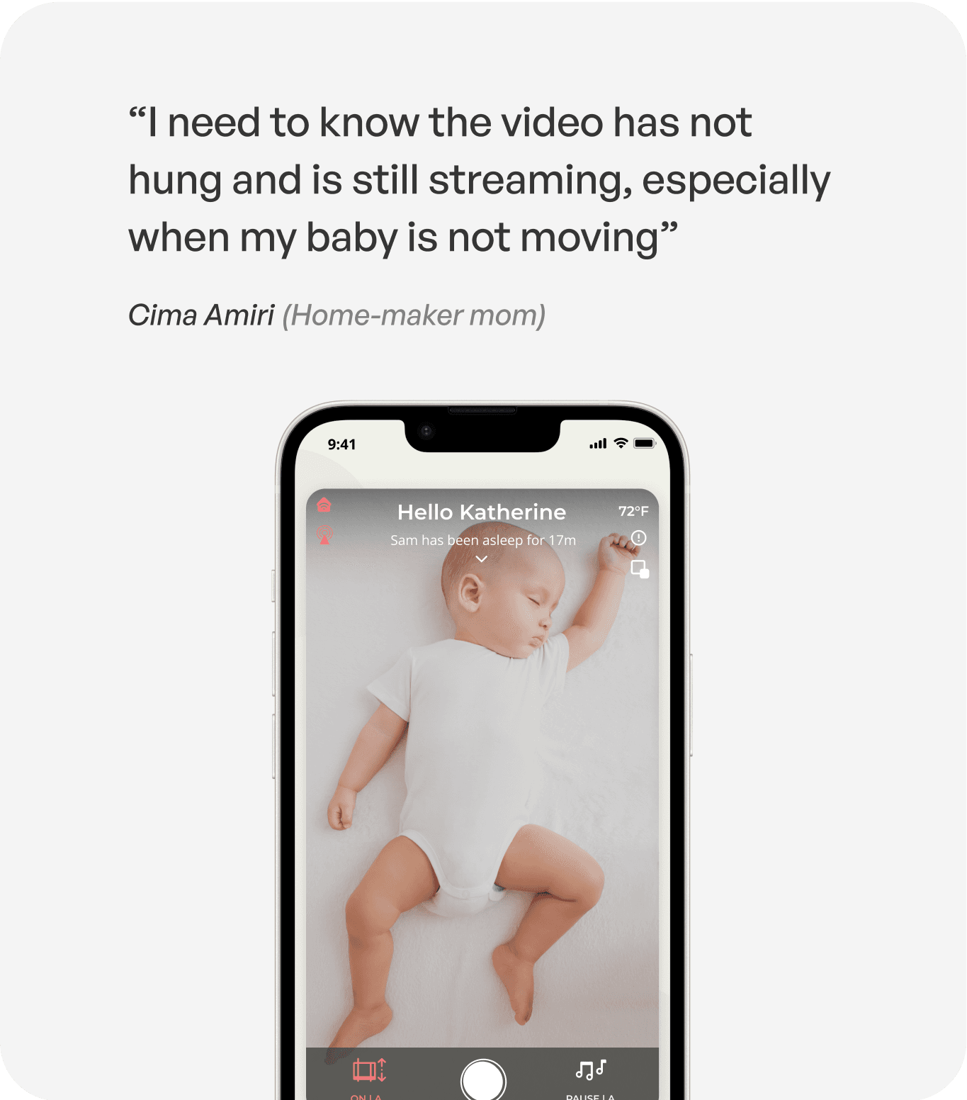
Constant Video Monitoring
Watch the baby in video and be assured
all okay.
01
Constant Video Monitoring
Watch the baby in video and be assured
all okay.
02
Crib Control
Control the crib’s bounce, and sound settings for their baby.
02
Crib Control
Control the crib’s bounce, and sound settings for their baby.
03
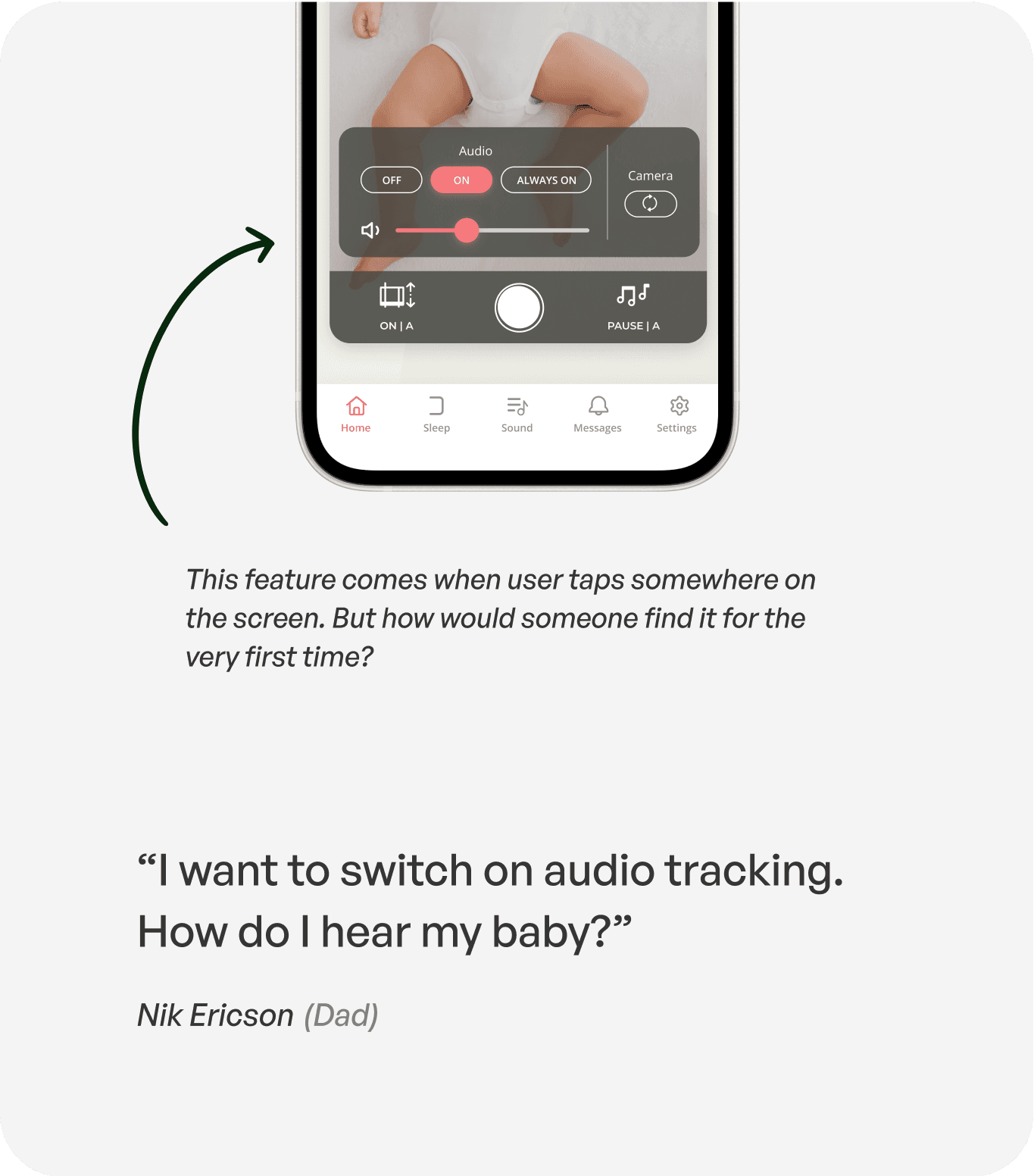
Monitor control:
Adjust their monitoring settings (audio tracking, camera positioning) to watch
the baby better.
03
Monitor control:
Adjust their monitoring settings (audio tracking, camera positioning) to watch
the baby better.
04
Summary info of baby’s sleep
Get a quick info recap on the baby’s activity, when did she sleep / wake up last?
04
Summary info of baby’s sleep
Get a quick info recap on the baby’s activity, when did she sleep / wake up last?
WHY WAS THIS PROJECT PRIORITIZED?
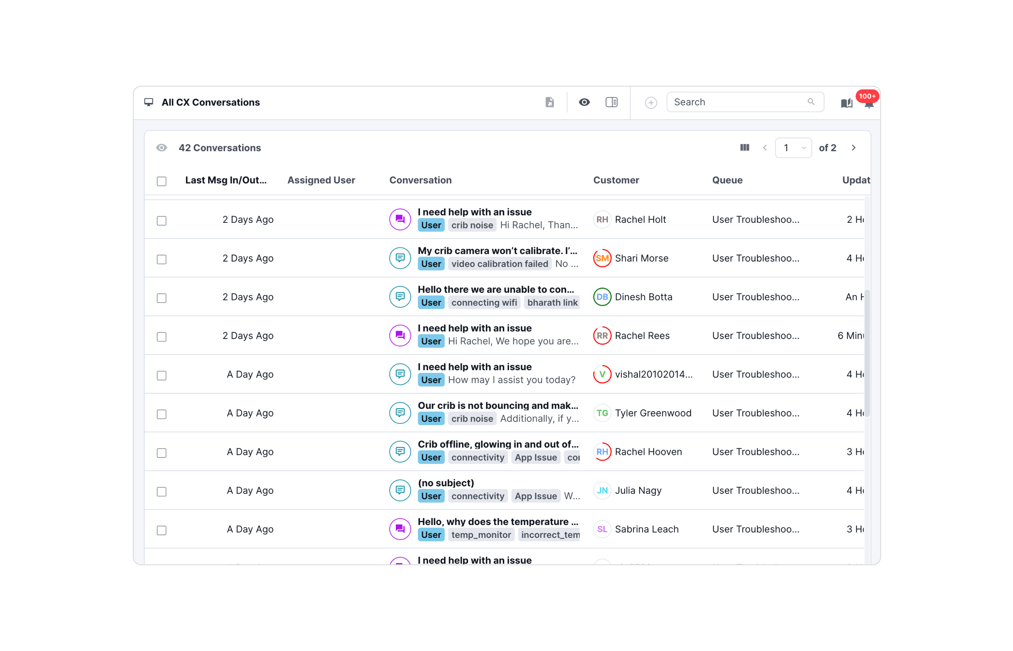
We have a very dedicated Customer Experience team and they were dealing with 100s of customer queries daily. 90% of them could be solved just through an intuitive app experience.
ISSUES THAT WERE REPORTED MAJORLY
UX CHALLENGES
UX CHALLENGES
01
Make them understand
Users were unable to grasp fundamental concepts such as "Auto mode" and "sound" because the app failed to provide clear feedback on the status of their actions.
01
Make them understand
Users were unable to grasp fundamental concepts such as "Auto mode" and "sound" because the app failed to provide clear feedback on the status of their actions.
02
Conversational Tone
The design and language used in the app came across as robotic, lacking the warmth and familiarity that users typically appreciate.
02
Conversational Tone
The design and language used in the app came across as robotic, lacking the warmth and familiarity that users typically appreciate.
03
Feature Bloat
A significant portion of screen space was allocated to features that were not frequently used.
03
Feature Bloat
A significant portion of screen space was allocated to features that were not frequently used.
PROBLEM STATEMENTS FOR ME
I tried to identify the reasons behind these issues and discovered the following problems on the home screen.
#01
AUTO & MANUAL CONFUSION
#01
AUTO & MANUAL CONFUSION
#02
TOO MANY THINGS, NO CONTEXT
#02
TOO MANY THINGS, NO CONTEXT
DAY 1: I STARTED WITH A SKELETON
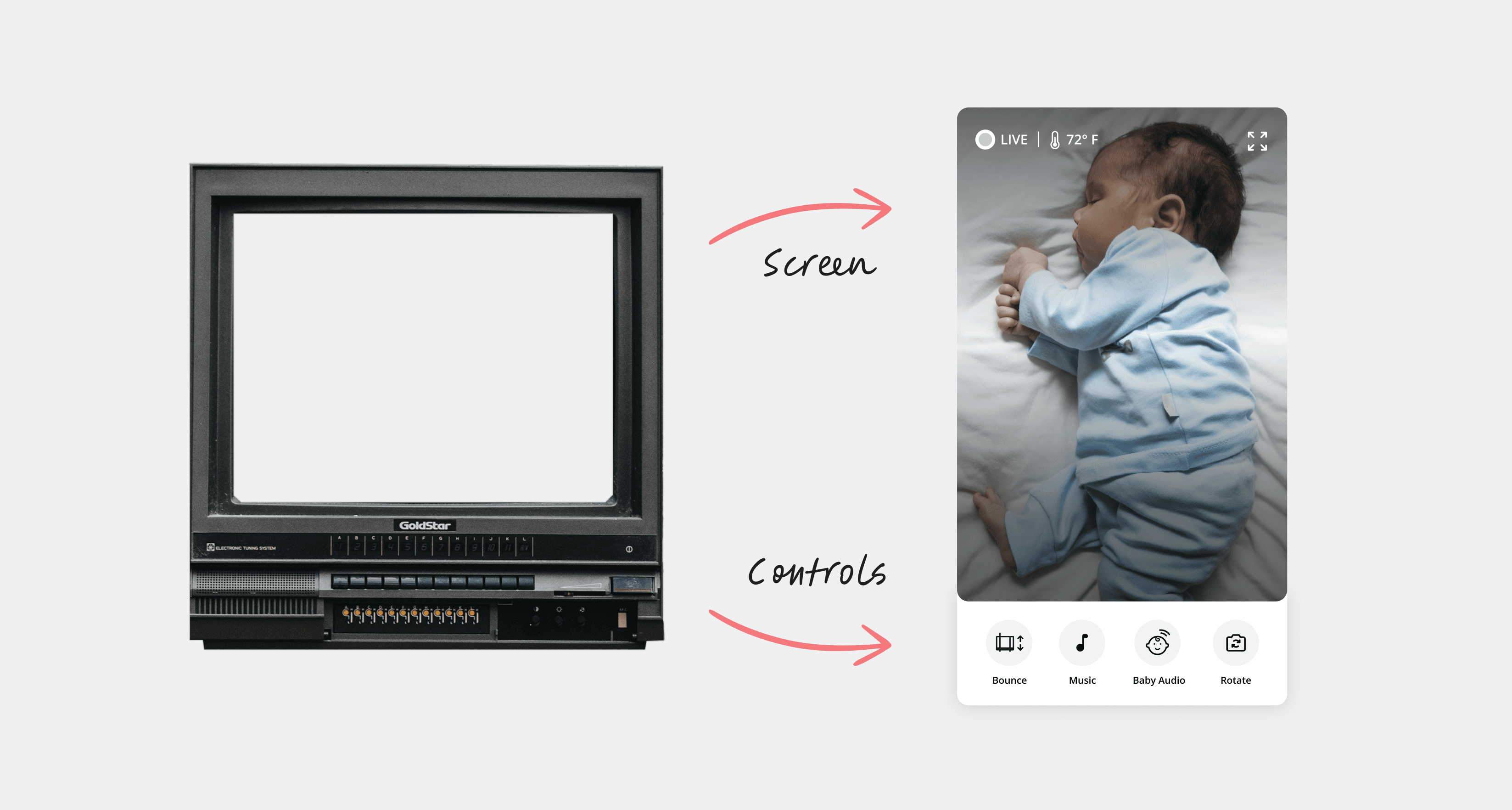
I took inspiration from the design of a classic television set. The familiar configuration of the television—with its distinct, uncluttered screen above and functional buttons below—serves as a guiding archetype for our digital design
It's like combining a bit of the old-school with the cool stuff we have today to help parents feel closer to their little ones, even when they're not in the same room.
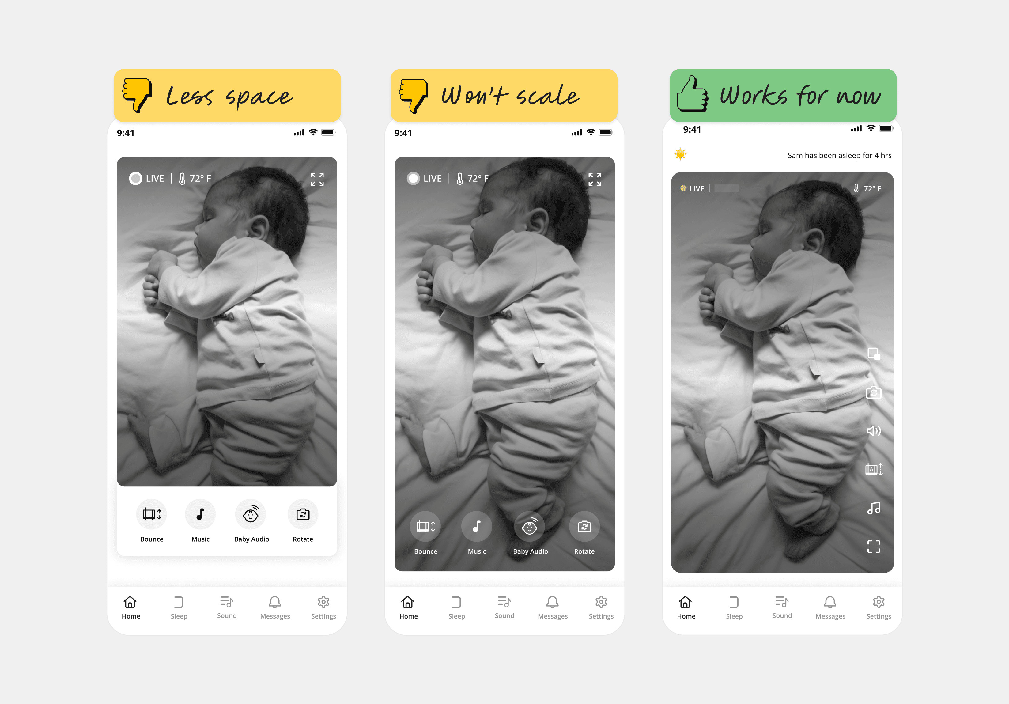
Given that we had a fixed 9:16 aspect ratio for the baby monitoring camera and were uncertain about which controls should be included on the home screen, we proceeded with the third version.
SPRINT 1: ADDRESSING BOUNCE ISSUES
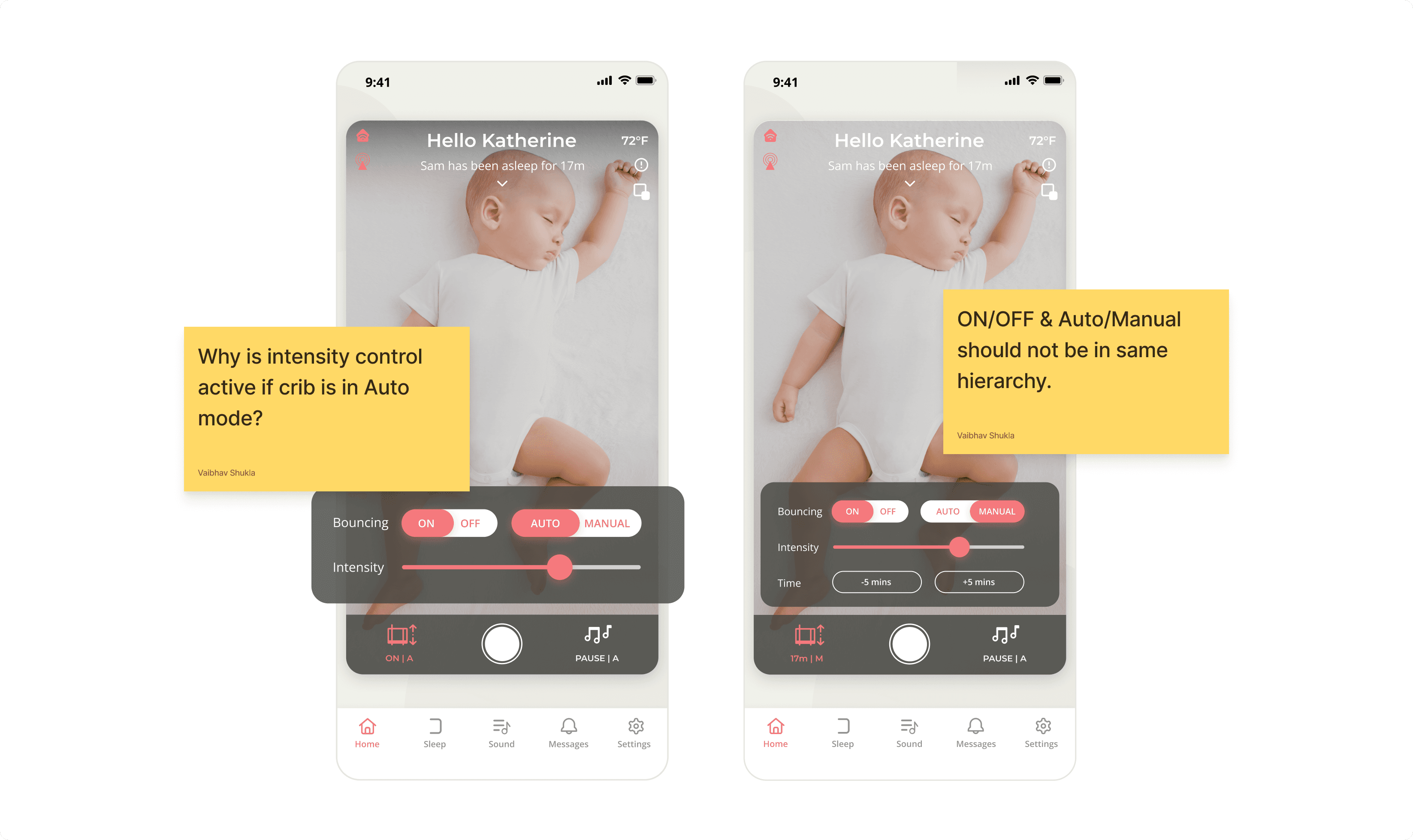
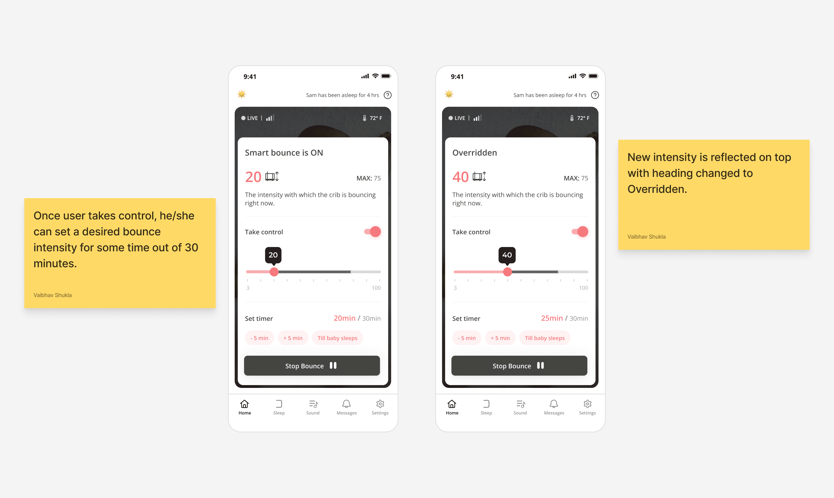
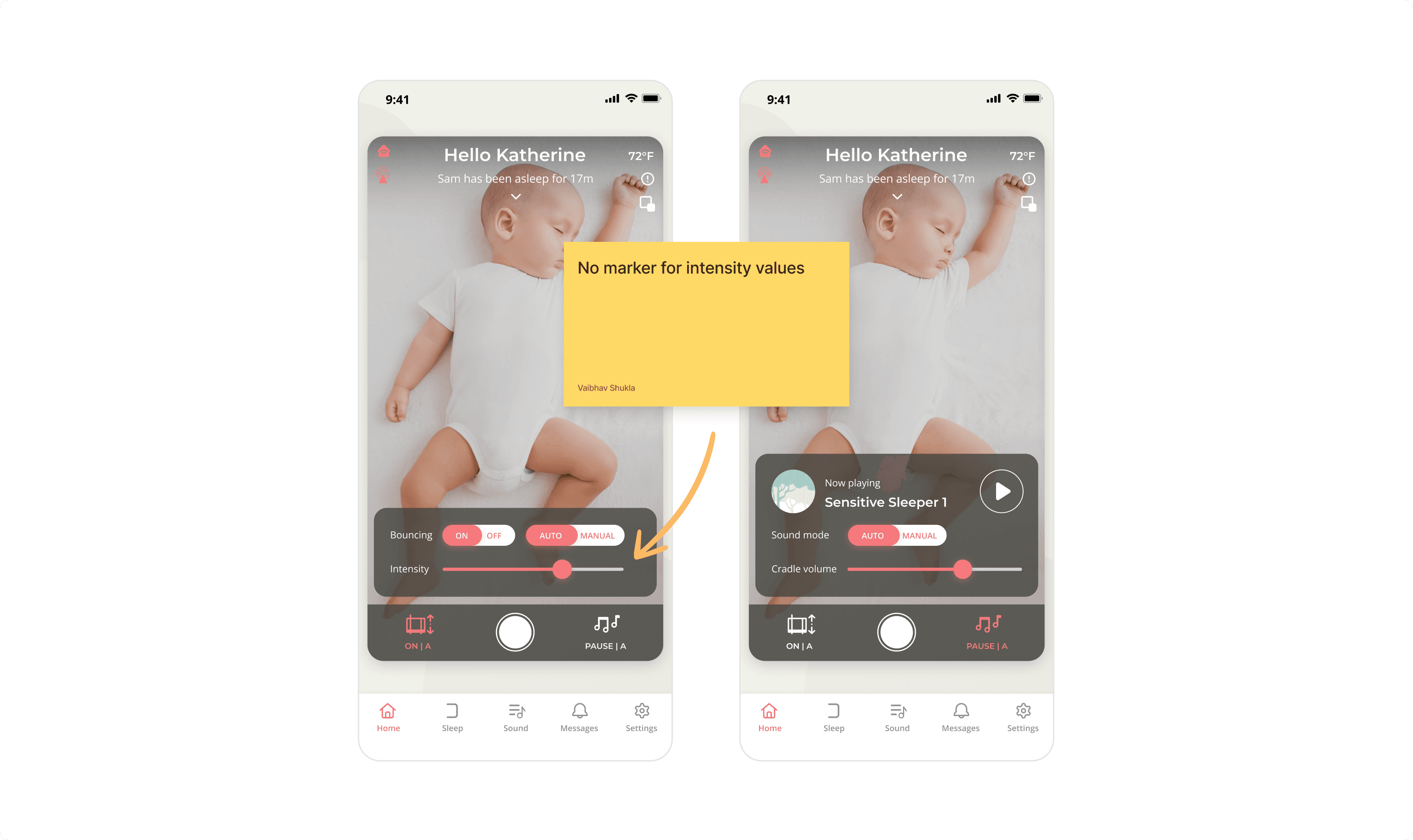
I found out that 95% of our users only used the "Auto" mode and not Manual for both music and sound. Why would someone wake up in the middle of sleep to change the bounce intensity again and again? And what is the point of a smart crib then?
IDEA #1
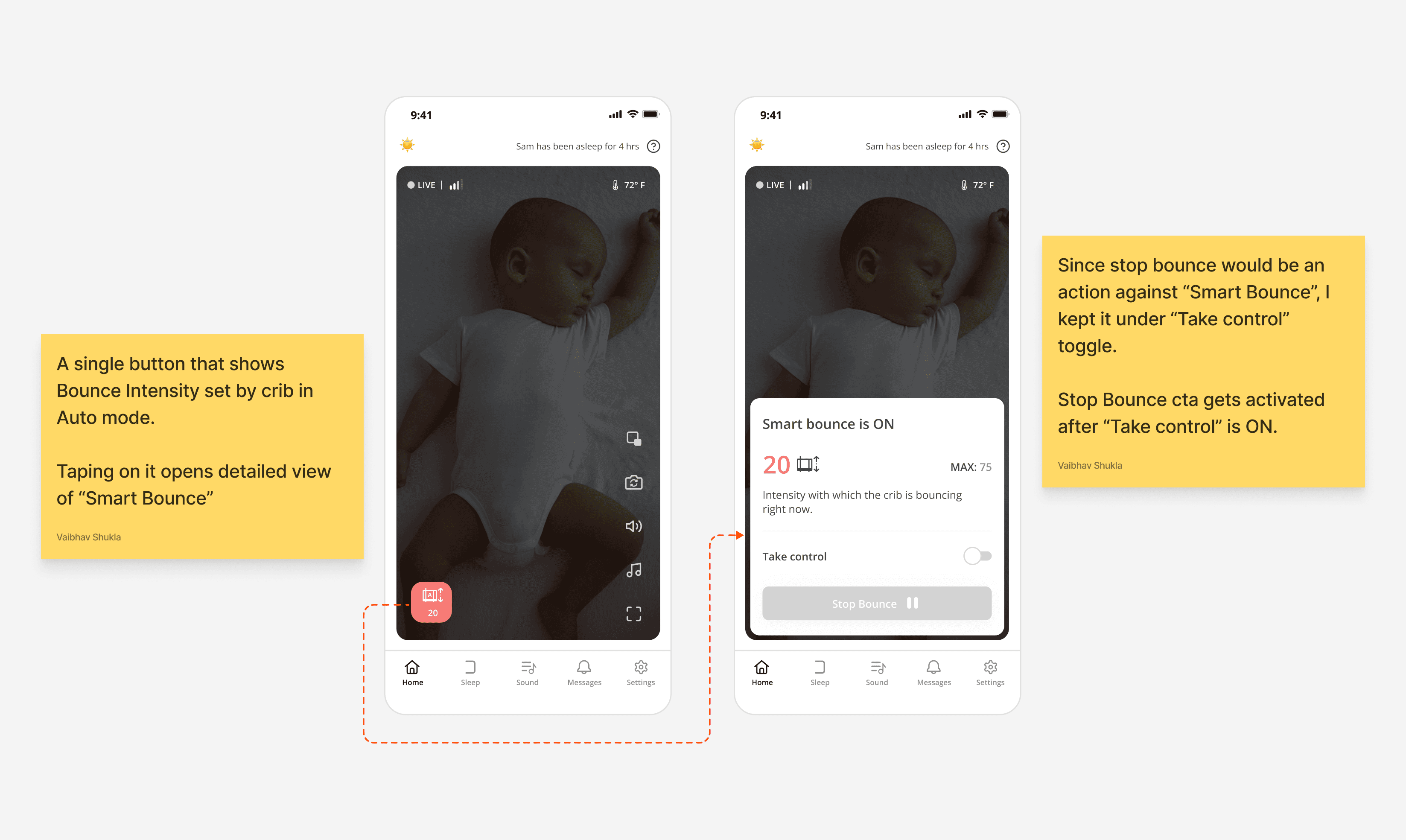
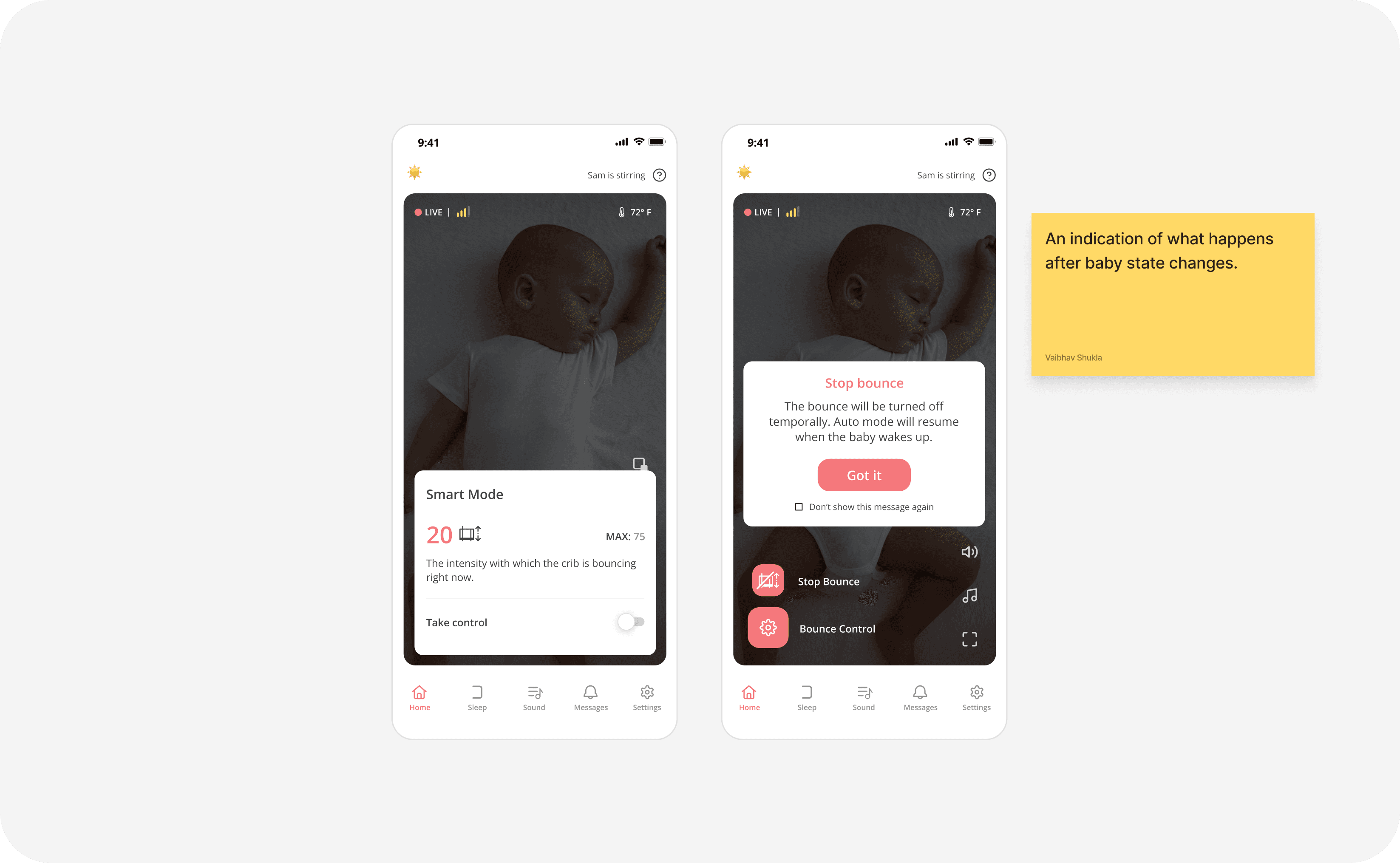
What if we do away with manual mode and make it a temporary control in Smart mode?
IDEA #1
What if we do away with manual mode and make it a temporary control in Smart mode?
Why failed?
- No indication of crib is working, after baby is kept inside crib.
- Since "Stop Bounce" was 2 level deep (Click on Bounce>Take control>Stop bounce) & users wanted this feature handy, this was not the optimal solution.
- When baby state changes, crib will again kick in Smart mode and change intensity. This information is not being conveyed here.
- Card UI hides baby view completely.
IDEA #2
Taking out Stop Bounce & indicating baby detection.
IDEA #2
Taking out Stop Bounce & indicating baby detection.
Why failed?
- This version was focussing more on "Stop Bounce" & Change intensity went bit away from the user.
Why failed?
- This version was focussing more on "Stop Bounce" & Change intensity went bit away from the user.
WE WERE STUCK, OUR CUSTOMERS CAME TO RESCUE
Since we were stuck, I thought talking to some customers would be a good way to get out of this confusion. We chatted with some customers to understand how they use Cradlewise.
MAJOR INSIGHTS
01
Bounce and Sound together
Parents preferred using both "Auto Bounce" & "Auto Sound" together, even though our current setup
separates them.
01
Bounce and Sound together
Parents preferred using both "Auto Bounce" & "Auto Sound" together, even though our current setup separates them.
02
Lil more control over smart mode
They trusted "Auto Bounce", but they needed a little control over it.
02
Lil more control over smart mode
They trusted "Auto Bounce", but they needed a little control over it.
03
Learnable controls
Parents use Cradlewise daily, so they wanted to know Smart mode intensity values for "Bounce" & "Sound".
In short, they needed less granularity which was missing in our current design.
03
Learnable controls
Parents use Cradlewise daily, so they wanted to know Smart mode intensity values for "Bounce" & "Sound".
In short, they needed less granularity which was missing in our current design.
SPRINT 2: MERGING SOUND AND BOUNCE IN A SINGLE ENTITY
IDEA #Nth 🎉
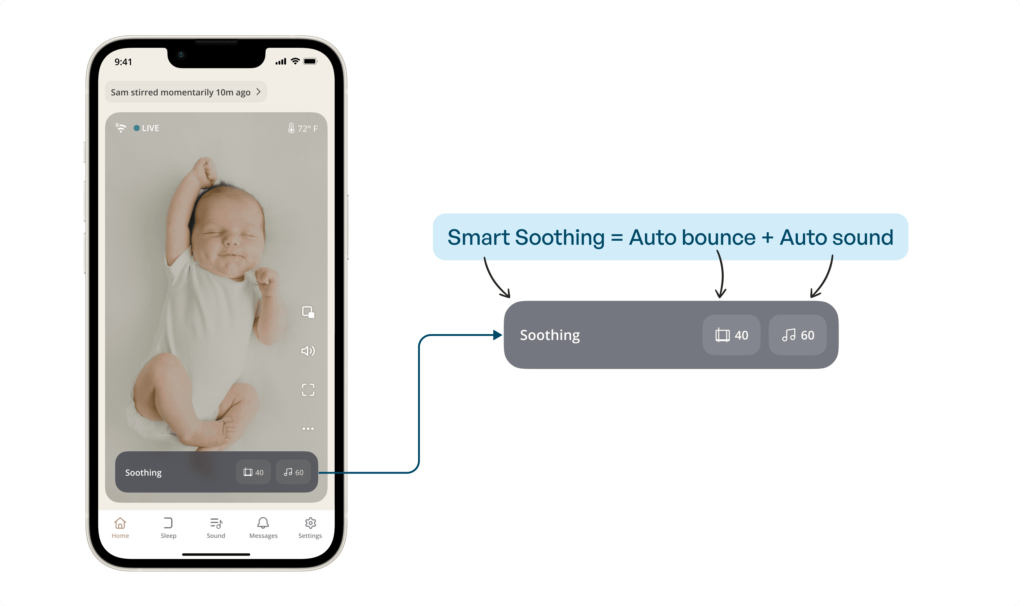
- What if we merged Smart Bounce and Sound in a single entity.
IDEA #Nth 🎉
- What if we merged Smart Bounce and Sound in a single entity.
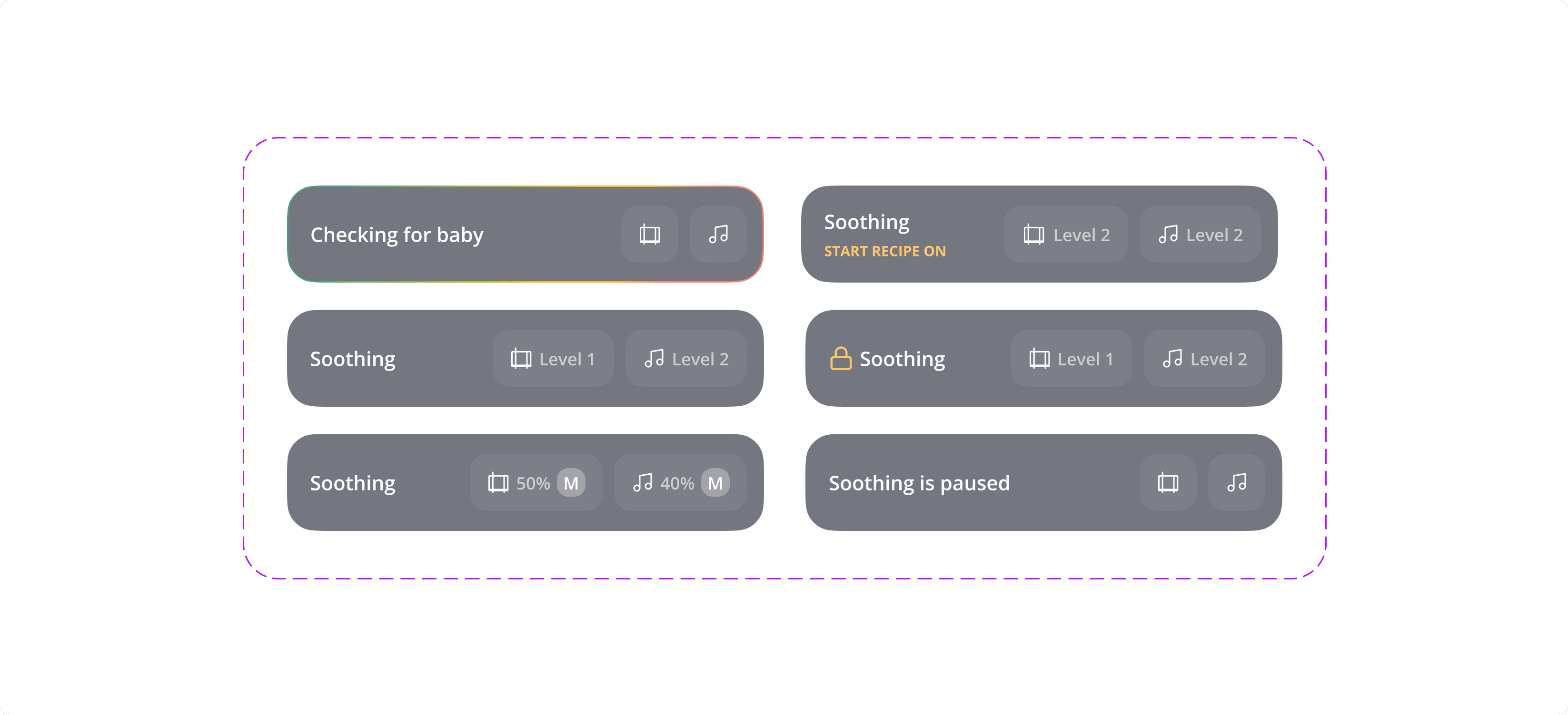
Soothing bar could be scaled to show every state of the crib.
It became the most used feature of the app
Soothing bar could be scaled to show every state of the crib.
It became the most used feature of the app
- What if we made controls less granular?
FINALLY WE REACHED TO
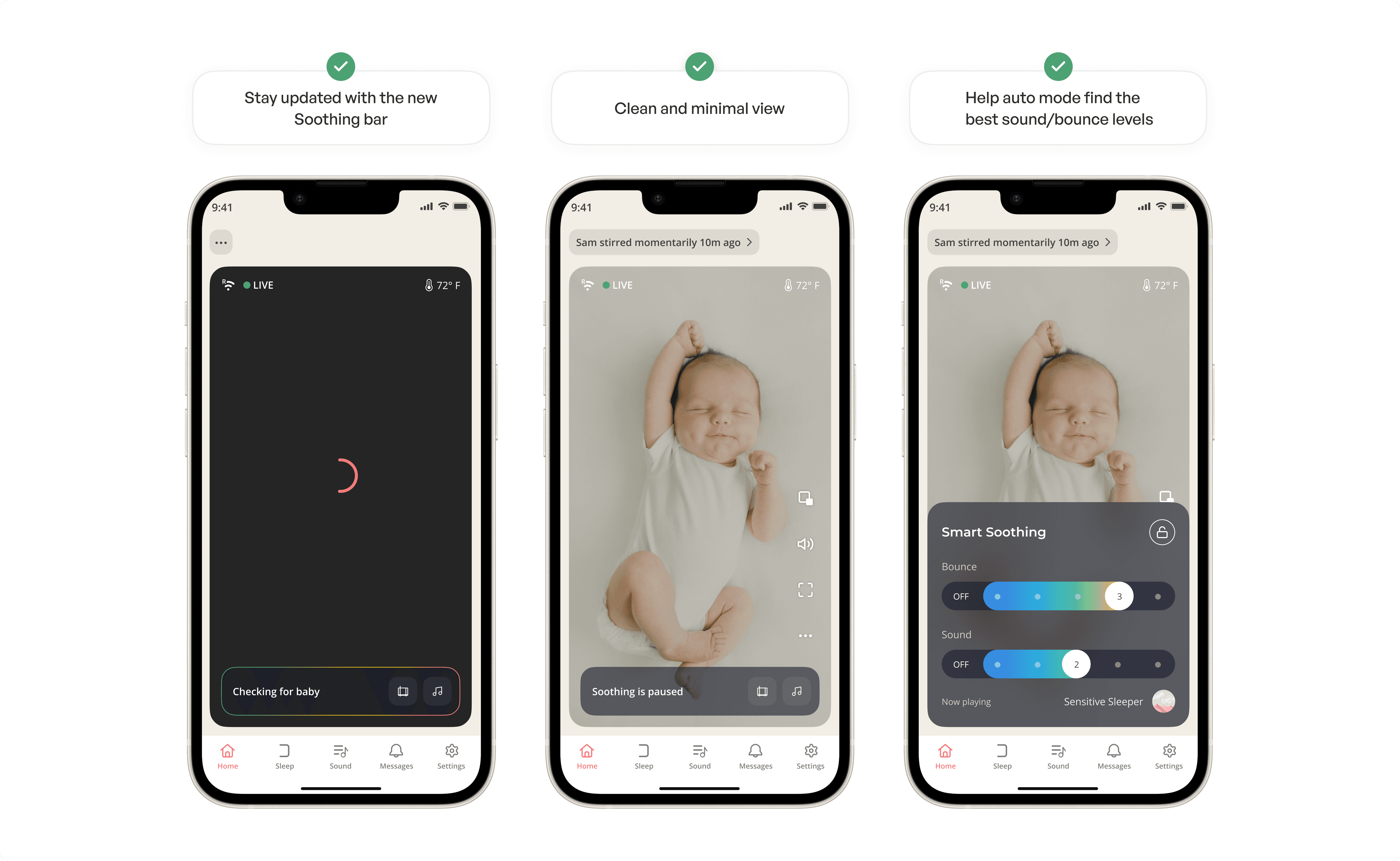
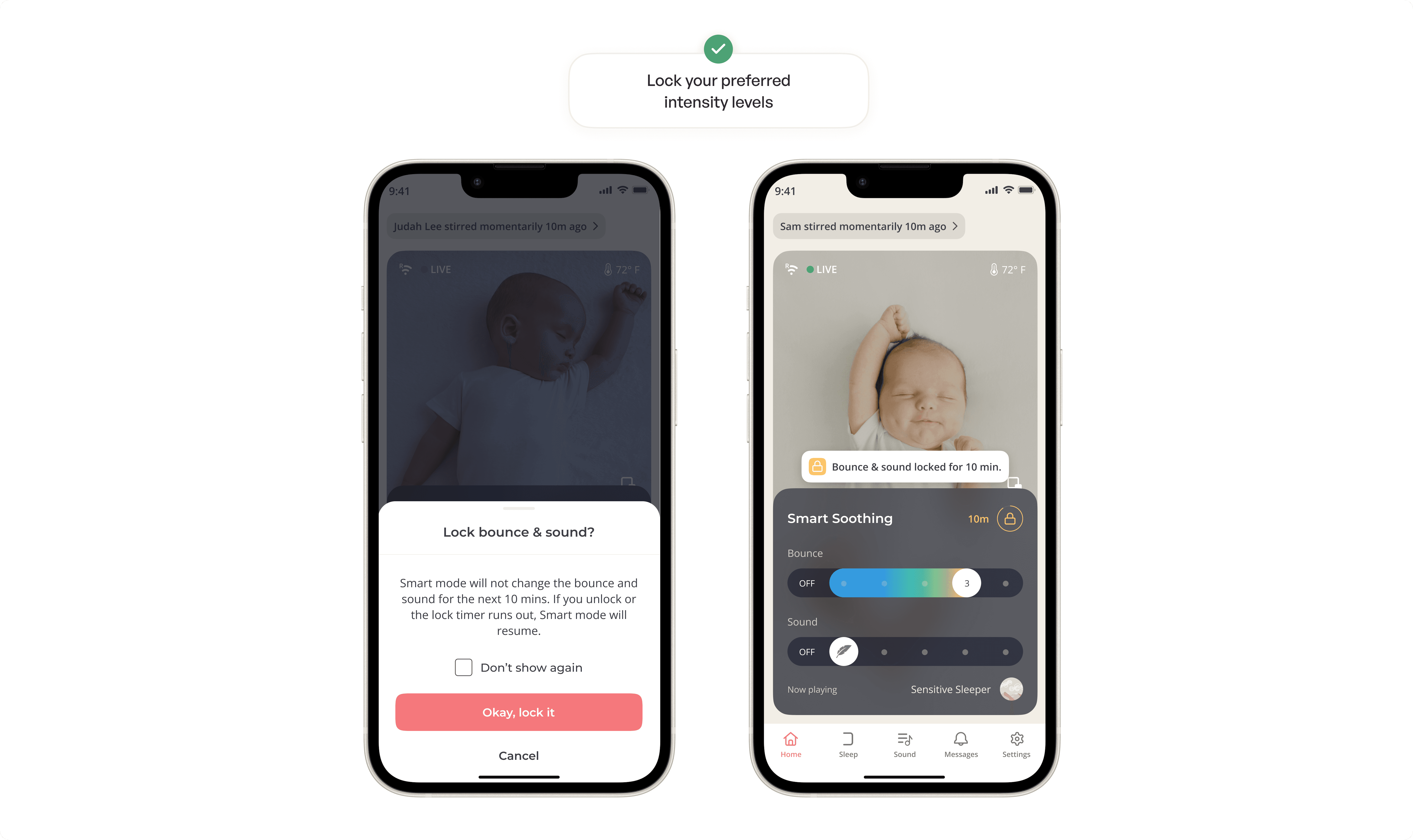
THE ALL NEW CRADLEWISE EXPERIENCE
BRUSHING MY MOTION GRAPHICS SKILLS
BRUSHING MY MOTION
GRAPHICS SKILLS
CREATED A SMALL FEATURE VIDEO TOO
CREATED A SMALL VIDEO TOO
THANK YOU FOR READING!
Feel free to connect let's chat about design, product, mentorship, community, or anything
© 2024 Vaibhav Shukla. All right reserved.
Feel free to connect let's chat about design, product, mentorship, community, or anything
© 2024 Vaibhav Shukla. All right reserved.